UI/UX design
Interfaces
people get
on the first try.
Make your website or app easier to understand and use. We research user needs, test ideas and design clear experiences that help people get things done.
UX/UI DESIGN / A CLEARER STARTING POINT
Good design starts
with the right problem.
For businesses launching something new, improving an existing website or app, or making a complicated journey easier for customers.
-
01
The problem
Customers struggle to find what they need, complete an order or understand your product. Or you need to test a new idea before building it.
-
02
What we do
Understand your users, frame the problem, map the journey and test design ideas with the people who will use them.
-
03
What you receive
Depending on the scope: research findings, prioritised improvements, tested prototypes and interface designs ready for development.
Before we build faster,
frame the right problem.
AI makes it easier to produce more, faster. The valuable work is deciding what deserves to be built and why it matters to the people using it.
Test an idea with customers before committing to development. Through problem framing and design sprints, we help your team agree the problem, explore solutions and test a prototype.
Talk about a design sprintA shared problem
Align around the people, the need and the outcome that matters.
A testable direction
Explore possibilities, make a prototype and learn from real users.
A clear next step
Decide what to build, what to change and what to leave behind.
Type, colour, system.
Choose a direction. Watch the typography, colour and components change together.
-
Display · Instrument Serif Body · Inter
-
Terracotta · Forest · Warm paper Violet · Lilac · Saffron Cobalt · Ice · Navy Warm, expressive and quietly confident. Bright, generous and a little bold. Precise, calm and built to scale.
-
Components · Editorial Components · Playful Components · Precision Soft corners. Warm accents. Clear actions. Round corners. Bold accents. Clear actions. Sharp corners. Cool accents. Clear actions.
Before and after.
The same booking flow, six weeks apart. Fewer fields, one decision per screen, and a button that says what it does.
A little room to change your plans.
Free cancellation until 10 Sep.
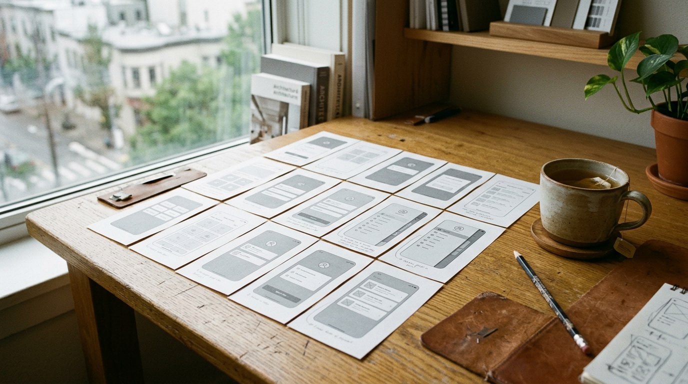
Sketch to system.
Six weeks, three stages. Prototypes in front of real users by the end of week two.
Start with a conversation.
You don’t need a finished brief. Tell us what you want to improve, or what you’re trying to work out.
We’ll help you find a useful starting point.
-
01 / WHAT HAPPENS NEXT
Tell us a little
Your challenge, goals and any budget or deadline you have in mind.
-
02 / WHAT HAPPENS NEXT
Talk it through
We discuss the work with you and whether we’re the right fit.
-
03 / WHAT HAPPENS NEXT
Agree the next step
A proposed approach, scope and fee for you to consider.